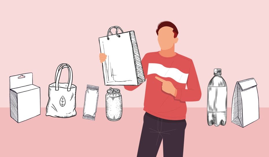
How to be special on supermarket shelves?
A food manufacturer has a few seconds to grab the attention of customers running to the shelves.
In order to sell packaging, it must meet the following basic principles:
- To distinguish the product from similar products and attract consumers;
- Thanks to the packaging, a person should immediately understand why they should buy it;
- When designing packaging, you need to rely on the real interests and expectations of potential buyers - you can't do without researching your target audience;
- Packaging should not cost more than the product itself (7-10% for mass market).
In packaging design, the main thing is functionality, not artistic preferences. Not everyone still takes this into account. Here are 10 rules to follow.
Build a hierarchy
The most important information should be in the eye of the beholder. Everything else is subordinate to it. The important things are in the centre. Information on the side is ignored.
The brain of a tired customer does not want to understand an abstract mishmash of various elements, without a centre and obvious structure.
The second information should be on the back of the package. Only the most responsible consumers, lucky owners of a lot of time and adherents of a healthy lifestyle are interested in details. Most buyers do not have extra time.

No questions asked
The buyer should know from the first second what is in front of him (if it is a new product on the market).
Whether you have the world's first Jerusalem artichoke chips or a natural smoothie jelly, you need to make it clear. Obviously, no one would guess.
But this does not mean that the word "tomatoes" should be written in giant letters on the can. Passing by a row of canned vegetables and seeing something red, shoppers will somehow understand that it is not green beans. It is important for them to know the varieties of these tomatoes.
Honesty
The image of the product on the packaging should not be very different from what the buyer sees when he opens it.
If the appearance of the product is not very attractive (children's food and any homogeneous product such as liquid cereals, purees, pates, etc.), it is better to ignore its appearance altogether. Packaging should emphasise the benefits of the product without hiding them too well. In this case, it is even more important that the porridge is natural (even organic), hypoallergenic, and contains minerals and vitamins.
Be careful with transparent windows on packaging and transparent packaging in general. This is only suitable if you are absolutely sure what your product will look like and be delivered successfully.
More specifics
Writing about "unique taste" and "guaranteed quality" is foolish. Everyone does it, it doesn't work anymore. And why should the buyer believe you?
If your product is cheaper, say so, in plain text. You can state in one sentence how you achieved a favourable price. If your product has unique ingredients, don't hesitate to mention it.

Use simple fonts
Handwritten fonts, fonts with jumps, extra-wide or extra-narrow letters, and combinations of three (or more) different fonts. Beautiful, but no. No vertical slopes, sine waves, parabolas, etc.
The exception is the use of complex inscriptions as logos.
It is also better to exclude illegible inscriptions (scattered elements, patterns, etc.).
Simpler.
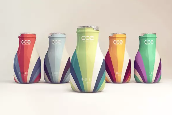
Be careful with the colour.
Packaging is an element of brand visualisation. Even if you really wanted to, you shouldn't ignore your brand colours.
Otherwise, it is better to use a time-tested winning combination. You don't need to be an expert to check what the colour wheel, extra combinations, triads, etc. are.
The golden rule is no more than five colours (excluding stretch marks) and about seven visual elements (inscriptions or images). The fewer and simpler, the better.
Too many neutral colours can make your product look invisible.
Distance yourself from competitors
Almost any juice pack you find on the shelf of your nearest supermarket is well designed: fresh colours, the right mix of reds and greens, images of juicy fruits and berries. But thanks to the high colour saturation, the shelves are a mix of packs from different manufacturers.
There shouldn't be too much design
Modern technologies allow us to implement any, even the wildest, fantasies in packaging. But the laws of the market are inexorable. Daring insights adorn designers' portfolios, but do not convert into sales.
Convenience should come first. Juice in a polyhedron tetrapack is easy to pour. A bottle of shower gel or dishwashing detergent in the form of a swollen droplet will slip out of wet, foamy hands.
How would you serve fruit or vegetable purees? Bright and creative? Let's say yes. Purees are mostly eaten by children, but parents buy them. So, you have to restrain your imagination. It is more important to show that the product is harmless.
What type of packaging should I choose? A convenient doy-pack with a dispenser? Probably not. Soft containers save mothers from having to carry not only a heavy glass jar, but also a spoon. But there is a caveat: if the dispenser is located on the side and bottom, it will not be very convenient for the child to use it. At the same time, for some kind of youth cocktail, such a container is quite OK.
Consider different design options
The information on the packaging should be clearly visible, even if your product is on the bottom shelf. Even if you put it in a box, a third of the label will be covered by the sides. Do not place important information in this section. Alternatively, you can make the design of the box itself interesting. This is called SRP - Shelf Ready Packaging.
Design models are usually reviewed and agreed upon after careful consideration. Allow the designer to visualise your product at different shelf levels, in vertical and horizontal positions, surrounded by other products.
Use of new formats
Tetra Pak juice replaced three-litre glass jars. With the introduction of soft doy-packs with dispensers, people are buying fewer glass or plastic ketchup bottles.
If you ignore trends, you will lose the chance to stand out on the shelf. In addition, sometimes new materials and formats make packaging more relevant.
Traditionally, laundry detergent was sold either in cardboard boxes or in huge plastic bags, which are not very convenient to use. Nowadays, packaging in zip-top doy-packs with a childproofing system is catching on. And it's even cooler to sell laundry detergent and gel in capsules with a soluble shell.
The new solutions provide good added value and are not much more expensive to manufacture. In some cases, manufacturers save money. For example, the same flexible doypack uses 80% less plastic than traditional plastic containers.
Our experts will tell you how best to work with product packaging, which solutions to use, and how to choose equipment for fruit and vegetable processing, aseptic packaging and sterilisation! Our solutions help you keep up with the constant changes.
We will help you choose new packaging equipment for the food industry, and our service department will provide a full range of technical support services. Our solutions will help you keep up with the constant changes. Contact us and as a result, your products will confidently stand out on the shelves.
+380 44 390 73 38
info@steiner.com.ua